
Why Good Design Is More Than Just Good Usability
On the three levels of emotional design, and why some products stay with us long after we’ve stopped using them.
There’s something strangely satisfying about closing an AirPods case.
That little magnetic snap. The way the lid settles perfectly into place. The smooth surface, the rounded edges, the reassuring weight of something so small.
None of these details makes the music sound better.
Yet they contribute to how we feel about the product.
I find that fascinating.
We tend to discuss good design in terms of how well something works. Is it intuitive? Can people accomplish their tasks? Does the interface make sense?
All reasonable questions. Important ones, too.
But they don’t quite explain why we develop such different relationships with products that do essentially the same thing.
Why does one notebook feel special while another is simply somewhere to write? Why do people grow attached to particular objects, even when cheaper alternatives perform just as well?
The answer, at least partly, lies in how design makes us feel.
Don Norman explores this beautifully in his book Emotional Design. He argues that our experience of products isn’t purely rational. We respond to them emotionally, often before we’ve had a chance to think about why.
He describes three levels of emotional design: visceral, behavioral, and reflective.
What I like about this framework is how it puts words to something we’ve all experienced but might never have stopped to examine.

The feeling comes first.
Sometimes you know you like something before you’ve even touched it.
A beautifully plated meal arrives at your table. You haven’t tasted anything, but you’re already looking forward to eating it.
Or consider unboxing a new iPhone.
The packaging is remarkably restrained. The proportions feel deliberate. Everything sits precisely where you’d expect it to. Even the way the box opens has received attention.
Apple has already started shaping your opinion of the product before you’ve switched it on.
That’s visceral design.
It’s our immediate response to what we see, hear, or touch. The impression arrives quickly, often before any conscious evaluation begins.
And it isn’t limited to objects we find conventionally beautiful.
Take the original Toyota Prius. Its distinctive silhouette communicated something about the kind of car it was, and perhaps the environmental values of the person driving it.
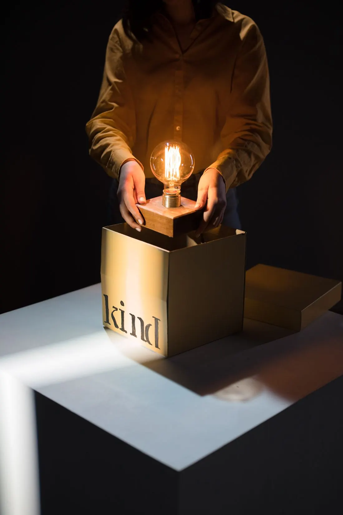


Photos: Ron Lach, Rachel Claire, LISH LENS, Pexels
The appearance carried a message.
Visceral design works through those immediate associations. Shape, colour, material, sound, and visual character all influence how we respond.
Of course, first impressions can be misleading.
A beautifully designed object can turn out to be frustrating to use. An unattractive one might become indispensable once we discover how well it works.
Which brings us to a different kind of satisfaction.

The pleasure of something just working.
Google Search has a remarkably simple interface.
A search field, a few familiar controls, and very little standing between you and the information you’re looking for.
You don’t need to think much about how to use it.
That’s the point.
Behavioral design concerns the experience of actually using a product. How well it works, how easily we understand it, and how confidently we can accomplish what we came to do.
Think about Tinder’s swipe interaction.
Whatever your opinion of the app, the gesture is an interesting piece of interaction design. Swipe one way, swipe the other. The basic action becomes understandable almost immediately.
It doesn’t need an elaborate explanation.
Now imagine two microwave ovens.
One has two dozen buttons, several cooking modes, and a collection of symbols you’ve never quite figured out.
The other has a handful of clear controls.
All you want is to heat your lunch for thirty seconds. Give it a try.
Skip the experimentMicrowave A 23 buttons
Microwave B 1 dial, 2 buttons
Both appliances may be equally capable of heating food, but the experience of operating them can feel entirely different.
That’s what interests me about behavioral design.
We often associate emotion with dramatic experiences: delight, excitement, surprise.
But there’s a quieter satisfaction in using something that works exactly as you expect.
No hesitation. No unnecessary decisions. No wondering whether you’ve pressed the right button.
Good behavioral design makes people feel capable and in control.
And when a product consistently respects our time and attention, we start to trust it.
That’s a powerful emotional response, even if we rarely describe it that way.

What a product says about us.
A Seiko tells time.
So does an inexpensive digital watch.
Yet it’s unlikely that someone buys a Seiko simply because they need to know whether it’s half past three.
A watch can represent achievement, personal taste, a significant milestone, or something someone hopes to pass down.
The object carries meaning beyond its function.
This is where reflective design becomes interesting.
At the reflective level, we interpret products through our memories, identities, aspirations, and cultural associations.
Consider a Moleskine notebook.
On a practical level, it’s paper bound together for writing. Plenty of cheaper notebooks can perform that job equally well.
But for some people, a Moleskine carries associations with creativity, literature, travel, and the romantic idea of keeping a notebook full of thoughts.
It becomes part of how they imagine themselves.
Patagonia offers another example.
A jacket keeps you warm. But Patagonia’s association with environmental responsibility can make owning one feel connected to a particular set of values.
Of course, buying something doesn’t automatically mean living by those values. Our relationship with brands can be more complicated than that.
Still, the associations influence how people experience the product.


Photos: Jacek Jan Skorupski, Gantas Vaičiulėnas, Pexels
Reflective design isn’t always about status or aspiration, either.
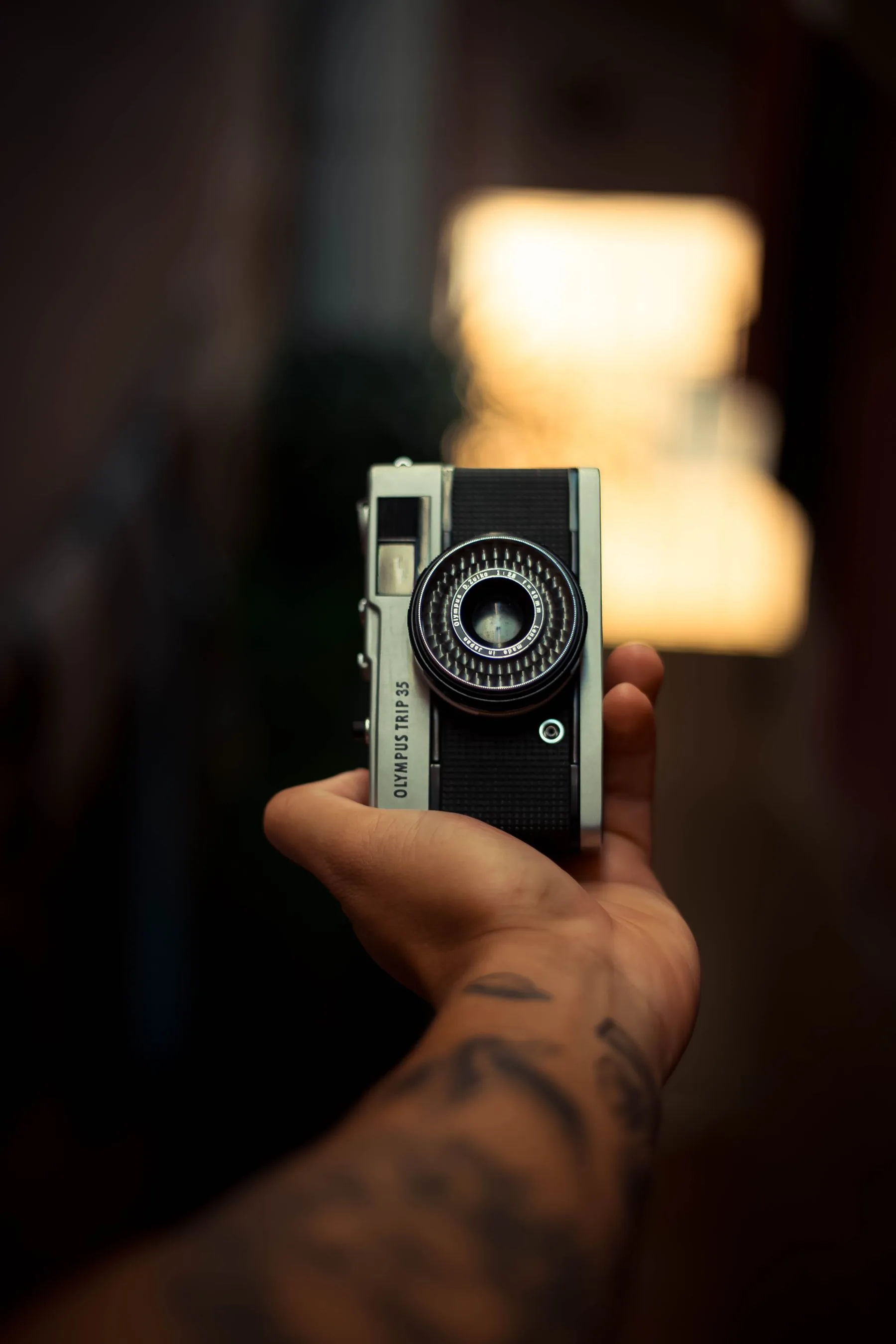
An old, scratched camera might mean more to someone than the newest model because of the photographs they’ve taken with it. A cheap souvenir can become irreplaceable because of a memory attached to it.
The object’s practical value hasn’t changed.
Its personal value has.
I think this is the most fascinating of Norman’s three levels, because it explains why our attachment to products can be so difficult to understand through specifications, features, or usability tests alone.
We’re not only responding to the object.
We’re responding to what it means to us.
One product. Three different experiences.
Let’s return to the AirPods case.
It’s a useful example because all three levels of emotional design exist within the same small object.
Three different responses. One product.
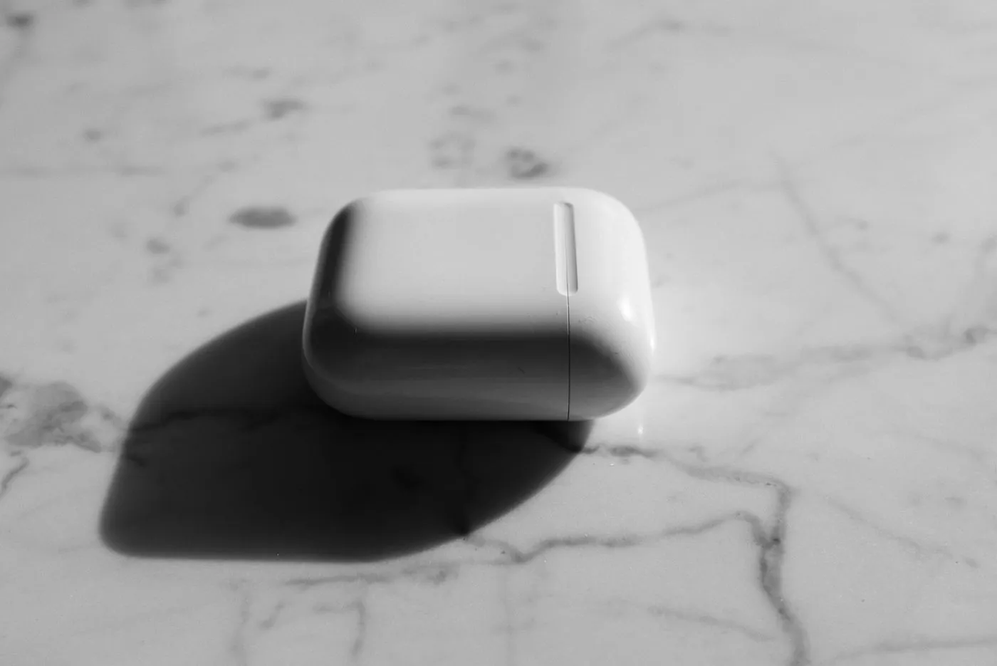
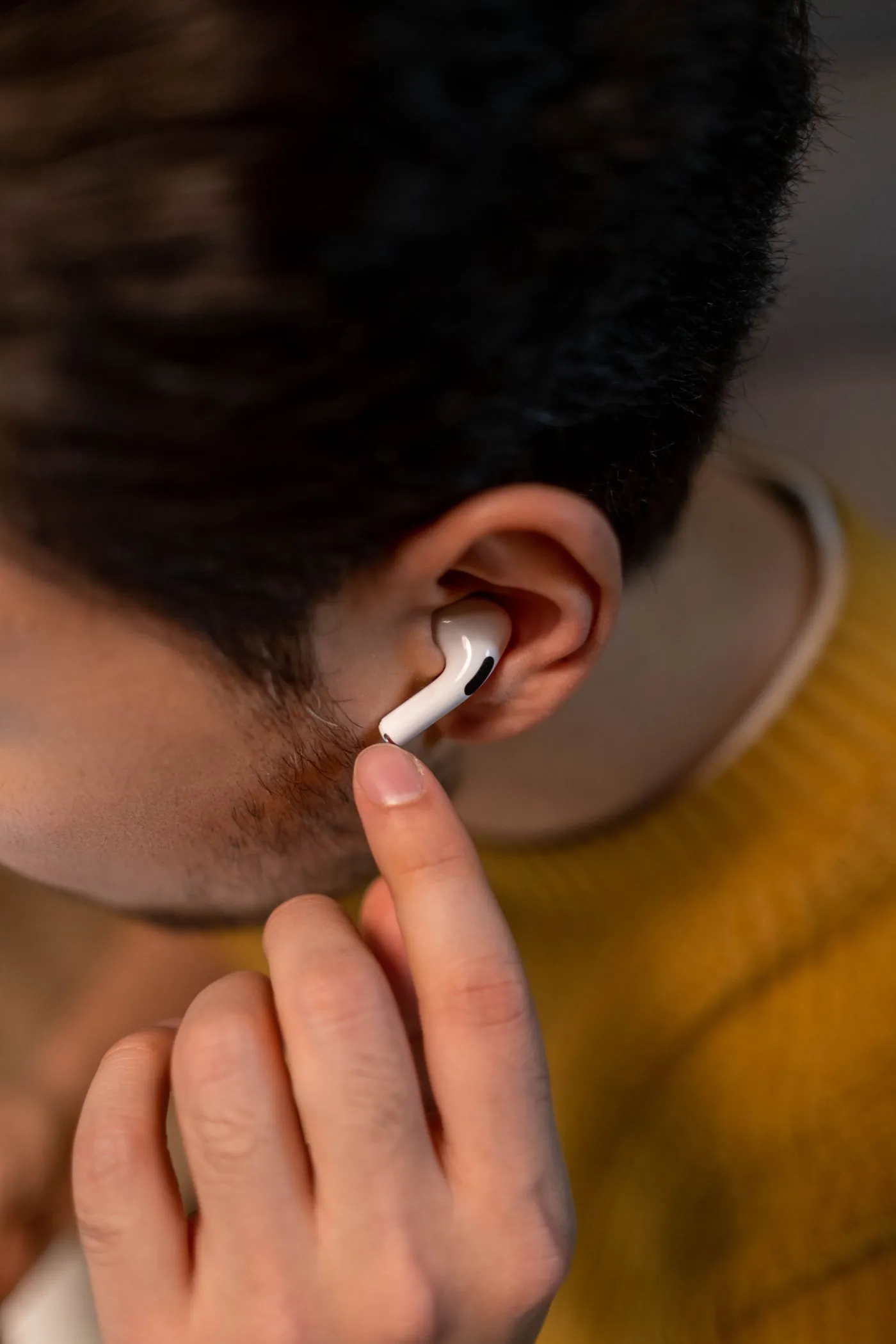

The smooth finish, compact proportions, and satisfying magnetic closure create an immediate impression. The object looks and feels considered.
Open the case, put the earbuds in, and they connect with very little effort. The charging case makes storing, carrying, and charging them straightforward.
AirPods have become recognizable cultural objects. For some people, they represent convenience, a particular lifestyle, or an association with Apple’s wider ecosystem.
Photos: Ready Made, cottonbro studio, MART PRODUCTION, Pexels
And none of them depends entirely on the others.
Someone might love how AirPods look but dislike how they fit. Another person might care nothing about the brand and simply appreciate how reliably they connect.
Someone else might have developed an attachment to their pair because they’ve used them every day for years.
Our experience of design is layered. That’s what makes it so interesting.
What does this mean for digital product designers?
We spend a lot of time thinking about usability.
User flows, information architecture, accessibility, conversion, task completion. These things deserve the attention they receive.
But people don’t experience digital products as collections of requirements.
They experience them as people.
Consider Duolingo.
Its colourful characters, playful illustrations, and expressive feedback give the app a recognizable personality.
That’s part of its visceral appeal.
The lessons, interactions, and progression systems shape the behavioral experience.
And for someone who’s maintained a learning habit over several months, the app might begin to represent discipline, progress, or a personal goal.
That’s reflective.
Or take Notion.
Its relatively restrained visual language can appeal to people who enjoy a sense of order. Its flexible structure makes it useful for organizing information. Over time, a carefully built personal workspace can become something users identify with and feel a sense of ownership over.
The same three levels are present, just expressed differently.
I think there’s a temptation to interpret emotional design as a reason to add more delightful animations, friendly illustrations, or playful microinteractions.
Sometimes those things help.
Sometimes they get in the way.
A reassuring confirmation after making a payment can be emotionally valuable. So can a clear error message that tells you exactly what went wrong and how to fix it.
Change the name and press Save. Then switch and do it again.
Neither needs to be particularly entertaining.
Good emotional design isn’t about making every moment exciting.
It’s about understanding how people feel throughout an experience and making thoughtful decisions in response.
The details are rarely just details.
One of the things I appreciate about Norman’s framework is that it encourages us to look beyond whether a product is technically successful.
Two products can accomplish exactly the same task and leave us with completely different impressions.
Sometimes the difference is obvious. One is beautiful, the other isn’t.
Other times it’s harder to explain.
Maybe the controls feel better. The feedback is clearer. The transitions are more natural. Or perhaps the product reflects something we value about ourselves.
These are not necessarily separate from usability. They’re part of the broader experience of living with a product.
And that’s why I think the small decisions deserve more attention than we sometimes give them.
- The visceral level shapes our first impression.
- The behavioral level shapes our experience of using something.
- The reflective level shapes what that experience comes to mean.
Not every product needs to be beautiful, playful, or deeply meaningful. Sometimes doing the job quietly and reliably is exactly what people need.
But a product is never experienced as functionality alone.
There’s always a person on the other side, bringing their expectations, memories, preferences, and emotions into the interaction.
We design the object or the interface. They experience everything around it.
And I think remembering that makes us better designers.
← All articles