
Have We Made Digital Products Too Boring?
On minimalism, the illusion of good design, and why craftsmanship still matters.
Everything is starting to look suspiciously familiar.
Walk into a newly opened café. Pale wood, beige walls, a carefully placed plant. Luxury fashion houses that once had unmistakable identities now sport nearly identical sans-serif logos. Car dashboards have traded buttons and dials for enormous sheets of glass.
And our digital products?
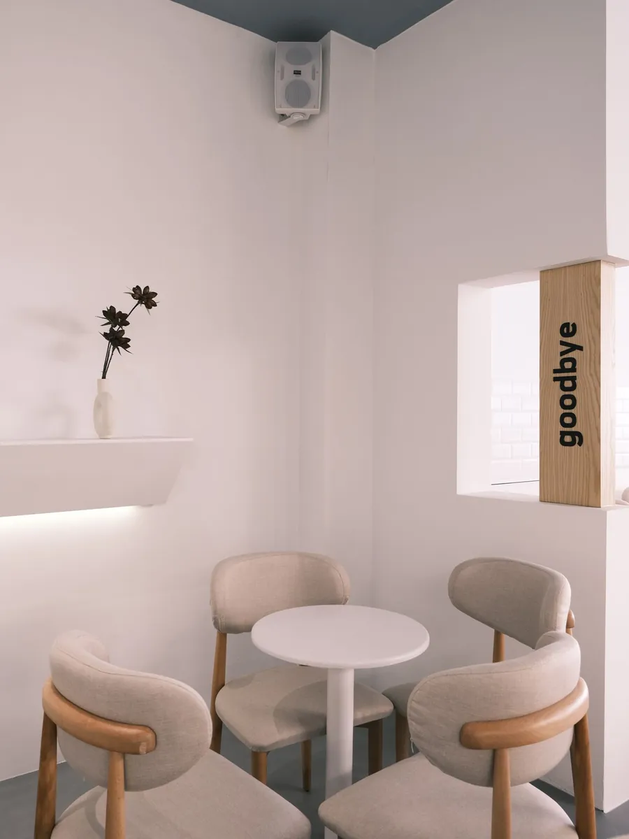
1 A café
2 A fashion house

3 A car
4 An app
Rounded cards. Muted colours. Tidy sidebars. Generous whitespace. Open five productivity apps and you might struggle to remember which one you’re looking at.
It’s all very tasteful.
I find that a little strange, because we’ve never had more sophisticated tools or greater freedom to design things. Yet so much of what we produce seems to follow the same visual formula.
I’m not convinced we’re making worse products. Modern software is often remarkably usable, accessible, and technically accomplished.
But I do wonder whether we’ve become better at reproducing the appearance of good design than at practising the craft behind it.
We’ve become very good at making things look minimal.
I love minimalism. Some of my favourite objects are almost absurdly simple.
Take the Braun T3 pocket radio, designed by Dieter Rams and his colleagues in 1958. A compact rectangular body, a circular speaker grille, and a few carefully placed controls. Nearly seventy years later, it still looks remarkably contemporary.
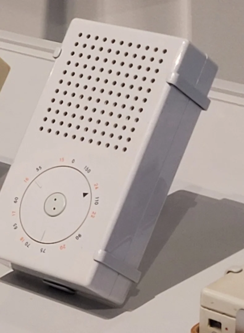
- A plain grid for the speaker
- One dial, set into the face
- Colour only where it carries meaning
- One shell, nothing added
Braun T3 pocket radio, Dieter Rams and colleagues, 1958. LACMA, Los Angeles. Photo: Superraptor123, CC BY-SA 4.0, via Wikimedia Commons (cropped).
Nothing seems out of place.
That apparent simplicity, though, is the result of an enormous amount of consideration. The proportions, the materials, the arrangement of controls, the relationship between what you see and what you touch. Rams cared about all of it.
His philosophy of less, but better has become something of a design mantra.
I sometimes think we’ve taken the first half rather more seriously than the second.
Minimalism has become a convenient visual vocabulary. Choose a neutral palette, remove decorative elements, introduce generous spacing, and the result immediately looks sophisticated.
We’ve learned to recognize these choices as signs of good taste.
But resemblance isn’t achievement.
A product with fewer elements isn’t necessarily better designed. Sometimes it’s just a product with fewer elements.
Writer and designer Jarrett Fuller raises a similar question in Graphic Designers Have Always Loved Minimalism. But At What Cost? He examines how an approach rooted in particular artistic and social ideas became a dominant aesthetic that designers reproduce almost instinctively.
That’s the part that interests me.
Minimalism once challenged established conventions. Now, in many corners of commercial design, it is the convention.
The problem isn’t that we keep making simple things. It’s that we’ve started treating simplicity as proof that we’ve made something good.
A cleaner dashboard. A more complicated experience.
Consider what has happened to car interiors.
Physical controls used to occupy much of the dashboard. Temperature dials, fan controls, radio buttons, switches for various functions. Perhaps not always elegant, but often easy to locate without looking.
Now look at a Tesla Model 3.
Much of the interior revolves around a central touchscreen. The effect is striking. An almost uninterrupted dashboard, very few visible controls, and an unusually clean interior.
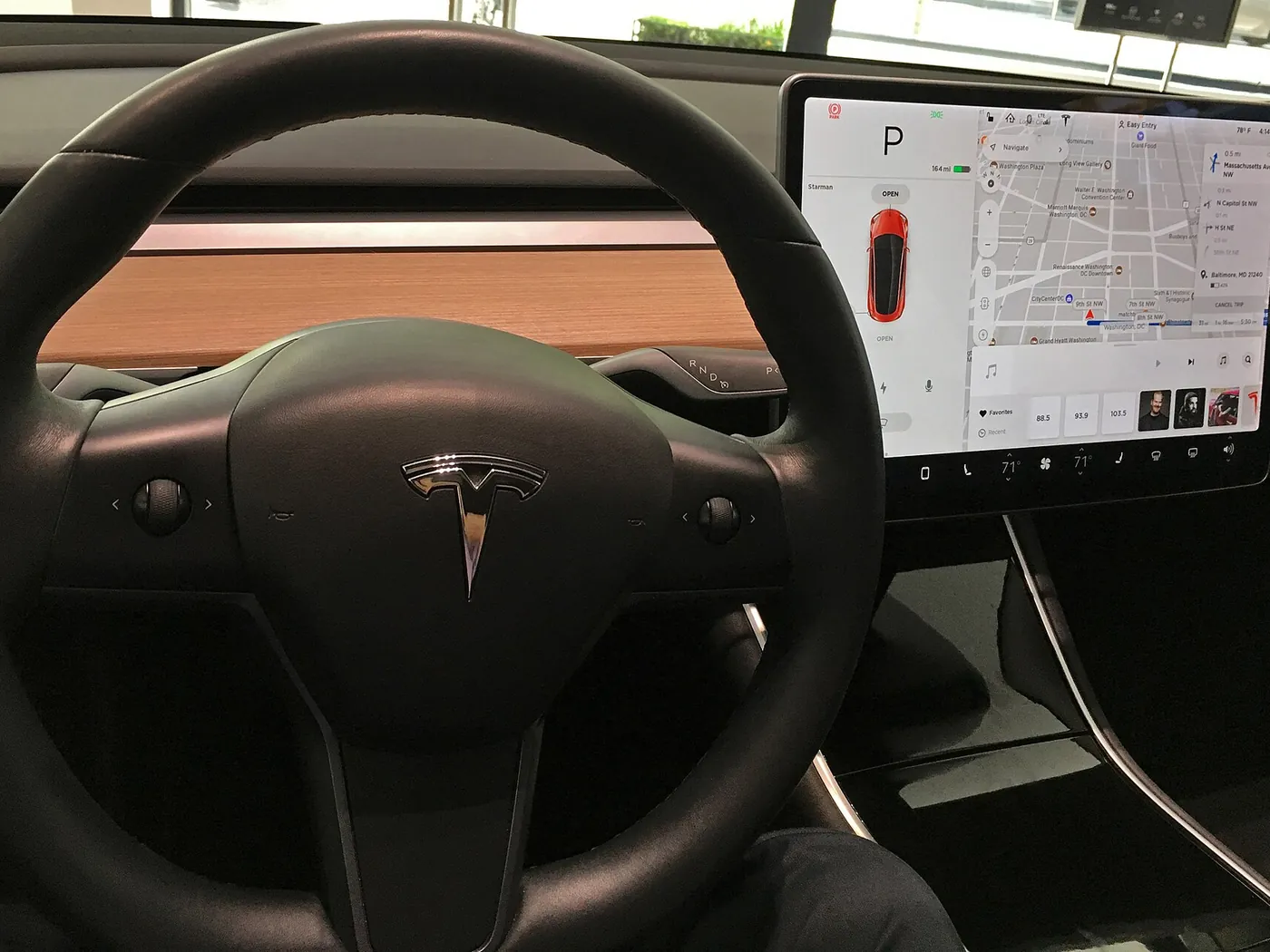
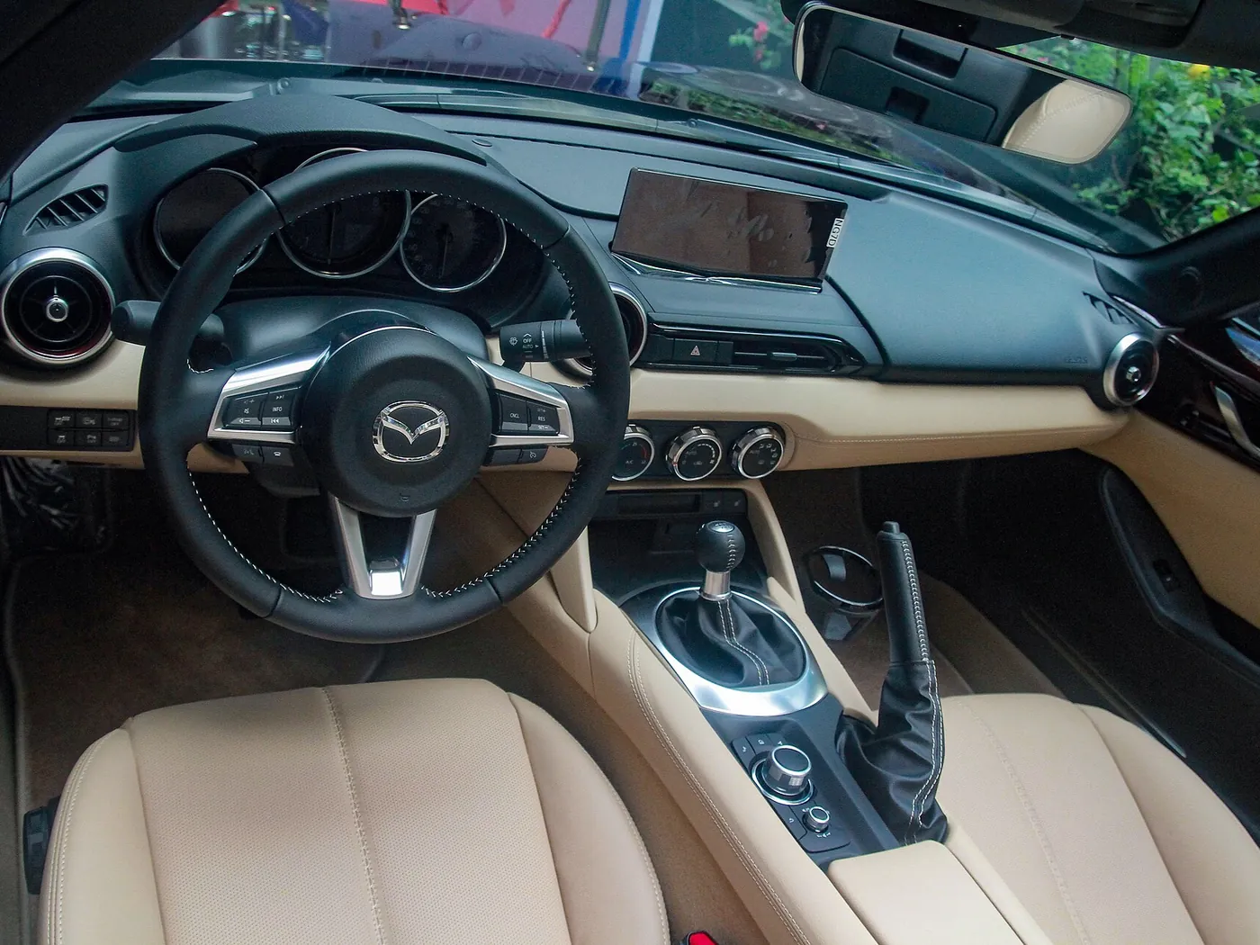
I understand why designers find that appealing.
But visual simplicity and ease of use aren’t interchangeable.
Adjusting the temperature with a physical dial can be a movement you barely think about. Put the same function inside a touchscreen interface and you may need to locate the control visually, interact with the display, and confirm the result.
Set the cabin to 21°.
An illustration of the steps each control asks for, not a safety test.
Physical dial
Turn it. Drag, or use the arrow keys.
Touchscreen
Find the right screen first.
The dashboard has become less cluttered. The task hasn’t necessarily become easier.
Euro NCAP’s 2026 assessment protocols place renewed emphasis on accessible physical controls for essential driving functions, reflecting concerns about distraction.It’s a useful example of how removing complexity from the surface can transfer it to the person using the product.
We do this in digital interfaces, too.
Hide navigation to make the screen cleaner. Replace descriptive labels with ambiguous icons. Move several useful actions into an overflow menu because the layout feels more balanced without them.
Sometimes these decisions help enormously.
Sometimes we’re simply making things easier to photograph and harder to operate.
I think it’s worth asking who benefits from the simplicity.
Two designers. Almost opposite philosophies. Equally compelling work.
One of my favourite things about looking beyond digital design is discovering how differently people approach the same fundamental questions.
Take Japanese architect Tadao Ando.
His Church of the Light in Osaka is astonishingly restrained. Concrete walls, a modest interior, and a cross-shaped opening through which daylight enters the building.
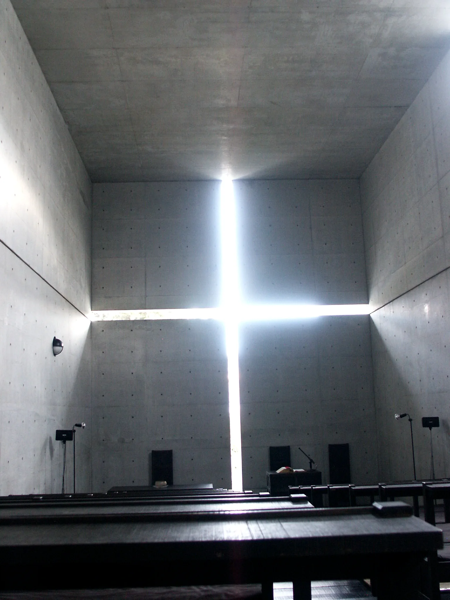
Very little happens visually.
Yet the relationship between the light, the concrete, and the surrounding space gives the building an extraordinary presence. Remove that careful consideration and you’re left with a concrete room.
Now put Ando’s work beside Ettore Sottsass’s Carlton room divider, created for Memphis in 1981.
It’s colourful, asymmetrical, playful, and almost ridiculous in the most wonderful way. It looks as much like an abstract sculpture as a piece of furniture.
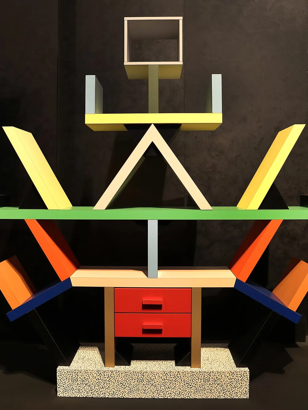
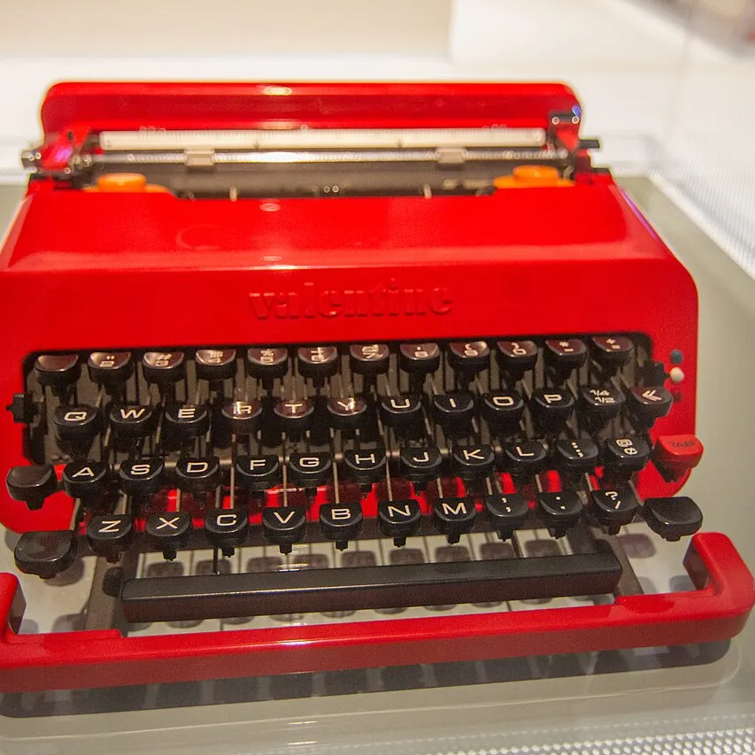
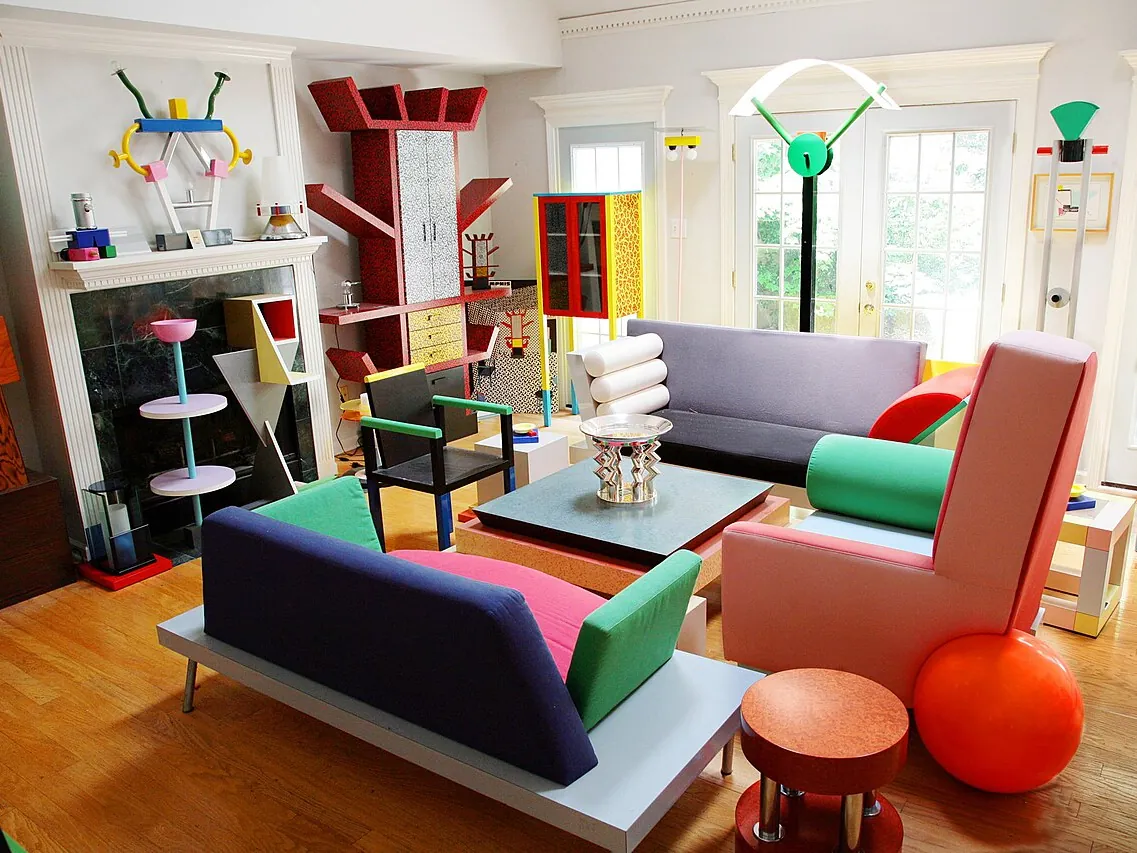
I can’t imagine two more different approaches.
Ando strips away almost everything. Sottsass introduces forms and colours that conventional modernist design might have rejected outright.
Neither is inherently superior. What makes both compelling is the conviction behind the decisions.
They have character.
And that character comes from more than surface treatment. It’s embedded in how the work occupies space, communicates an idea, and asks people to experience it.
I often think about this when designing interfaces.
We wouldn’t judge architecture entirely by whether the doors open and the corridors lead somewhere useful. We expect those things to work. Then we consider proportion, atmosphere, materials, light, and how it feels to inhabit the space.
Why should digital products escape the same scrutiny?
People spend hours inside software. They navigate through it, develop habits around it, and form opinions about it.
Usability is essential.
It’s hardly the end of the story.
When did following the system become the achievement?
Product designers talk a great deal about design systems.
Components. Tokens. Variants. Spacing scales. Governance. Scalability.
And with good reason.
A well-built system makes complex products easier to maintain. It establishes consistency, helps teams collaborate, and prevents us from solving the same accessibility and interaction problems over and over.
I use design systems. I value them.
What concerns me is the tendency to treat compliance with a system as evidence that the design itself is good.
A screen can follow every guideline, use every approved component, and pass a design review without containing a particularly thoughtful idea.
Everything is correct.
Nothing is memorable.
One task, built two ways: set a watering reminder for a fern.
A. System-compliant
New reminder
B. Considered
Water the fern
Every days, in the .
- Leads with the task, not the form.
- The setting reads as a sentence you can check.
- Shows the result before you commit to it.
Both offer the same settings and do the same job. The fern and the app are invented for this example.
I’ve always gravitated towards the craft of designing: the details that don’t necessarily appear in a component specification.
How an element responds when you interact with it. The way a transition carries your attention from one state to another. An unusual layout that communicates something more clearly than the conventional one.
Sometimes I’ll keep experimenting with an interaction that already works because something about it doesn’t feel quite right.
Maybe the timing is slightly off. Maybe the feedback lacks clarity. Maybe another approach could make the entire experience more natural.
It’s difficult to quantify that instinct in a design review.
But I think it’s worth developing.
Yesenia Perez-Cruz, who has worked on design systems at Vox Media and Shopify, discusses this tension in Beyond the Plateau of Sameness. She argues for distinguishing between the foundational components that make teams efficient and the product-specific experiences that deserve more individual attention.
That distinction makes sense to me.
A checkbox doesn’t need a new visual language every time we use one. But a product’s defining interaction might deserve considerably more thought than simply finding the closest available component.
A design system should give us a foundation to build upon, not a ceiling we aren’t allowed to go beyond.
I sometimes worry that the profession has become better at explaining why a design is consistent than why it’s actually worth using.
Those aren’t the same conversation.
There’s something valuable about actually making things.
In nineteenth-century Britain, the Arts and Crafts movement challenged aspects of industrial production that separated the designer, the maker, and the object.
William Morris and others believed that craftsmanship involved more than the appearance of the finished product. They cared about materials, labour, skill, and the relationship between people and the things they produced.
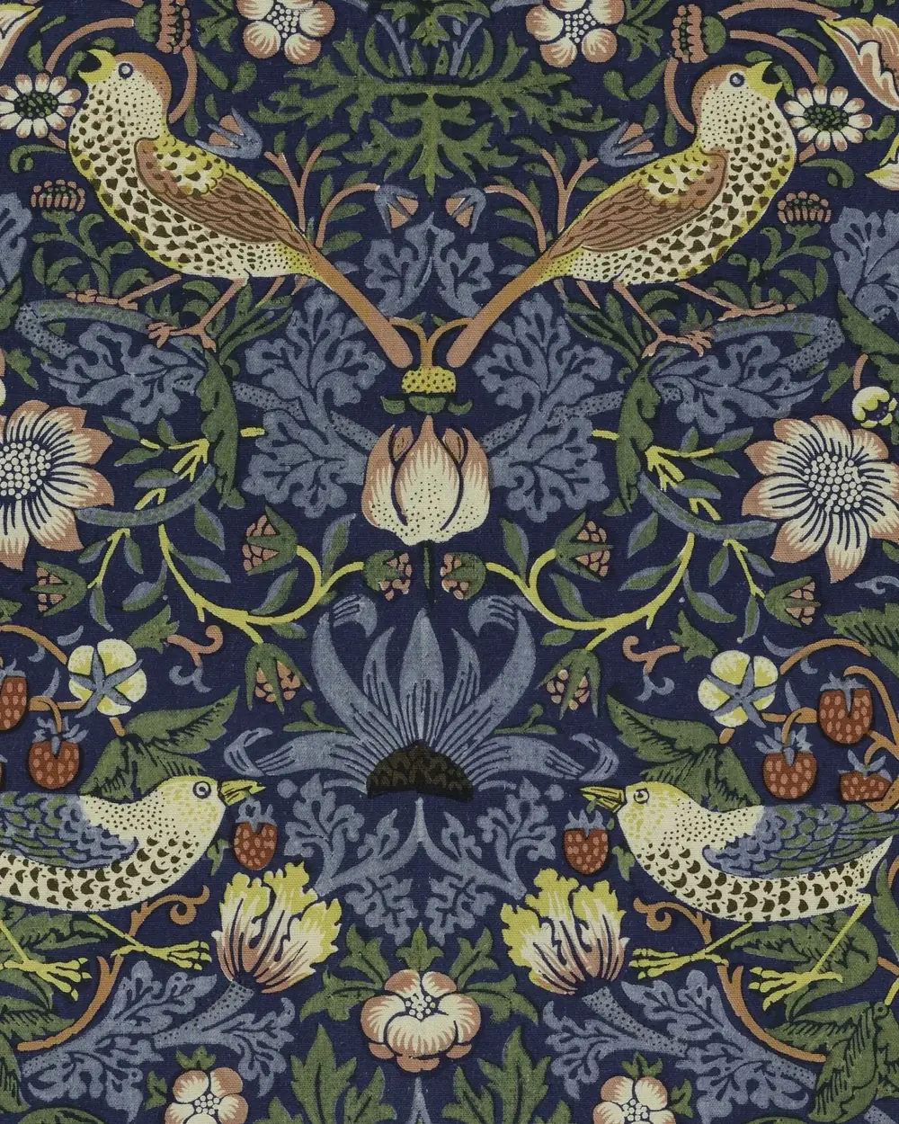
I’m not suggesting we return to handcrafting every interface element.
That would miss the point.
What interests me is the knowledge you acquire through making something yourself.
I’ve had plenty of ideas that looked perfectly convincing in Figma and felt wrong once I started interacting with them.
An animation that seemed elegant in a prototype felt sluggish in practice. A layout looked balanced until real content exposed its weaknesses. Something I expected to be complicated turned out to work beautifully with a much simpler approach.
i.
Technically works
ii.
Elegant in the prototype, sluggish in practice 1.6s
iii.
The layout feels strangely empty
iv.
Fern, watering notes
Saved to your notes
A little more attention
You discover these things by making, testing, and revising.
There’s no substitute for that feedback.
Yet we often discuss experimentation as though it’s an inefficiency to eliminate. We want shorter design cycles, faster handoffs, fewer revisions, and maximum component reuse.
All reasonable goals.
But if every improvement in efficiency comes at the expense of exploration, what exactly are we improving?
I’m not advocating endless polishing. Spending a week refining an interaction nobody needs isn’t evidence of good craftsmanship.
The skill lies in recognizing which details deserve the effort.
Then putting it in.
AI makes this question even more interesting.
A polished interface is becoming remarkably easy to produce.
Give Claude Code or Codex a reasonably clear description and you can have a responsive website or working application in surprisingly little time.
I find that exciting. I’ve been experimenting with these tools extensively, and they’ve changed how I approach building things.
But they also reveal how easy it is to settle for familiar solutions.
Without a strong visual direction, AI-generated interfaces often gravitate towards recognizable patterns: rounded cards, conventional layouts, predictable typography, and the occasional tasteful gradient.
- Sidebar on the left
- Three stat cards in a row
- The same violet accent
The results can be impressive.
They can also be interchangeable.
I’m not particularly interested in blaming the tools. They reproduce patterns that already exist throughout digital design, and those patterns became popular for understandable reasons.
The more interesting question is what we do now that execution has become so much easier.
Suppose something that once took an entire afternoon can now be built in twenty minutes.
Do we simply produce more of it?
Or do we use the remaining time to explore ideas we previously couldn’t justify trying?
I’d rather experiment.
Build an interaction. See how it feels. Change the timing. Try a different composition. Discover that the original idea was wrong and pursue something better.
When making becomes cheaper, curiosity becomes more affordable.
That should be an extraordinary opportunity for designers.
I’d hate to see us use it merely to produce the same acceptable interfaces at greater speed.
Of course, some products should be boring.
I don’t need my banking app to surprise me when I’m transferring money.
I don’t want a government form to experiment with unconventional navigation. And I certainly don’t need an elaborate animation every time I book a medical appointment.
Sometimes the most thoughtful design decision is to leave something familiar.
Predictability builds confidence. Established patterns reduce the effort required to learn new products. Accessibility often depends on recognizable conventions and reliable behaviour.
These aren’t compromises. They’re qualities worth designing for.
And personality isn’t synonymous with colour, illustration, or movement.
Look at Linear. Much of its character comes from precision, restraint, speed, and the careful arrangement of information. It doesn’t need to turn every interaction into an event.
A well-crafted form can be quiet. A thoughtful confirmation message can be ordinary. An excellent interface might barely draw attention to itself.
That’s still craftsmanship.
What I’m questioning isn’t restraint, or even standardization.
It’s the habit of accepting the first sufficiently polished solution without asking whether the experience could be better.
There’s a difference between choosing simplicity and defaulting to it.
I want more evidence of thought.
Perhaps that’s what I find missing in some contemporary products.
Not colour. Not ornamentation. Not animation.
Thought.
I want to feel that someone considered the possibilities, made deliberate choices, and cared about the result beyond whether it met the requirements.
Sometimes that means a beautifully minimal interface, refined until nothing unnecessary remains.
Other times it means taking a risk. Trying an unexpected composition. Giving a product a little humour, character, or visual identity that belongs to it rather than to whichever design trend happens to be popular.
We have an extraordinary collection of tools at our disposal. Sophisticated design systems. Powerful development frameworks. AI that can turn an idea into a functioning prototype almost immediately.
We should be able to make more interesting things than ever before.
And yet I sometimes wonder whether the convenience of these tools is making us a little too comfortable with the familiar.
I don’t think we need to abandon minimalism or start challenging every established pattern.
I think we need to be more selective about what we accept as finished.
A clean interface isn’t necessarily a thoughtful one. A consistent product isn’t automatically a distinctive one. And an efficient design process doesn’t guarantee a worthwhile result.
The qualities I admire most in design are much harder to standardize: curiosity, judgment, patience, taste, and the willingness to keep exploring when the obvious solution already works.
I don’t want every product to look different simply for the sake of being different.
I want each one to feel like someone made an effort to understand what it could be.
We know how to make things look like good design.
I’d like us to put just as much care into making sure they actually are.
Have our digital products become too similar, or have we simply grown accustomed to the conventions that make them work? I’m interested in where other designers draw the line between consistency and character.